Showing posts with label True Color Rendering. Show all posts

Sunday, June 2, 2019

Kodak Color Plus 200 Film Test for the Frugal Film Project

I'd mentioned the Frugal Film Project before.  I decided to use my Goodwill purchased Canonet and settle on Kodak Color Plus 200 as my inexpensive film. 


Since I didn't have the Canonet in Arizona at the time.  I did a preliminary film test using my Minolta X-700 and a Macro lens at the Mayo Clinic Cactus Garden:


I was generally happy with the results and am awaiting the processing 
of my first roll from the Canonet.

Thursday, September 20, 2018

Como Round House


See the conditions Before the  Roundhouse Restoration here.  And read more about the Project here.


Not sure I like the Lomo 400 color rendition of RED.  Not so good with a bright sky.

Monday, May 15, 2017

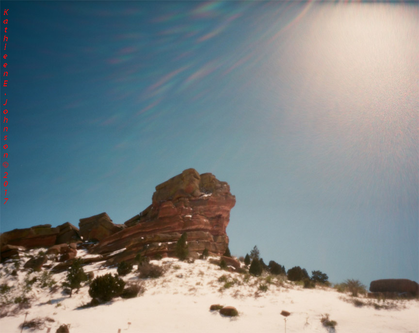
52 Rolls Week #17: Results for Worldwide Pinhole Day!

The results from Worldwide Pinhole Day posted on the 52 Rolls Project.  My favorite shot below with an interesting effect cause by the sun.


Monday, October 10, 2016

52 Rolls Week 38:52

Film Test and chasing Fall across Colorado.  We find ourselves at Boreas Pass, a place we've been before.

First we revisit the Baker Water Tank taken in 2011 with my last 120 roll of Kodak 100GX:


Next an image from this year taken with Fuji Velvia 50:


And a comparison to Fujicolor Pro 400H:


Yu can see why I preferred Kodak E100GX to Velvia 50....It has better true color rendering.  The Velvia 50 image would need more manipulation.


See the Current Film Test Results Here.

Friday, September 16, 2016

52 Rolls Week #33 Updates

Some experiments based on suggestions from 52 Rolls posted comments.

First lets revisit Portra 160 with warming filter:


The suggestion was to adjust the White balance and reduce the 'warming'.  Now I typically use warming filters with chrome films, which tend to be very blue.  Example below, same scene, Velvia 50 with warming filter:


Now lets look at Portra 160 with White Balance adjusted (in Photoshop Levels):


And Portra 160 with both the White Balance and Black adjusted (in Photoshop Levels):


This one is getting closer to the natural color, but still a bit off.  One viewer commented that your film choice is a reflection of your interpretation of reality.  I like that!  So I'll stick with the Chrome version of reality.


Friday, August 19, 2016

Happy World Photo Day!

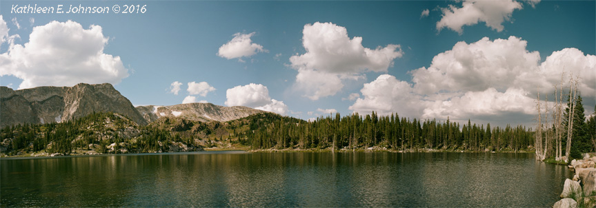
Couldn't miss out on a post today.  So I'm combining old and new techniques here.  Photomerge of 3-Mamiya 7 images from Wyoming's Snowy Range:


From Mirror Lake.............More later as we will do a film comparison here and look at some B&W images too.

Thursday, July 30, 2015

Garden Flowers #2

Wide view of the Front Yard:


 And another angle:


For more detailed flowers look back at earlier garden images Made with Film:


Saturday, August 9, 2014

Saturdays Online: The Photochrom Age

Hand Colored Images from the 1800's.  How many of us have (or have seen) old photos that were 'hand colored'?

These are great.........And a reasonably easy to understand explanation of what a PHOTOCHROM is. They were willing to do a lot of work to get color.  Why Are we so Lazy Now?

Didn't have any Photochromes lying around the house.  So I'll just have to leave you with another 'lost' film type:

Tuesday, July 8, 2014

Going Out of Focus with Eli Vega

We try so hard to achieve that perfect focus.  But Recently I saw a presentation by Eli Vega, Colorado Photo Artist, that emphasized looking at the abstract.

So I thought I would try some of his, multiple exposure and going out of focus techniques.  Obviously I need more practice to get the desired result.  But What do you think of Going Out of Focus?

Eli's Technique:
  • Set your camera for multiple exposures (Mamiya 645 allows this)
  • First take a sharp in focus image
  • Second, go out of focus and take one or more additional images
 After looking at his website, I think that bright colors with lots of contrast with the background creates the best effect.  Of Course I looked at his website, after my attempts did not turn out as I wanted.


So, we'll try this one again, with brighter colors and more Contrast......

Friday, September 21, 2012

Last Comment on Loss of Detail

Our Final E100VS vs Provia 100F: Note the Loss of Detail


Can you tell which is which? E100VS or Provia 100F?


Monday, September 17, 2012

More on Loss of Detail............

Bill brought up an interesting point yesterday, so I pulled up another example:


 Fuji Provia 100F Above, E100VS Below.  All I can say is that obviously the emphasis on vivid saturation of the color has a strong affect on detail, especially in the red/orange/pink range of shades.  E100GX did not have that problem (e.g. yesterday's posting).


Sunday, September 16, 2012

The Final Test!

So why am I going through all of this?  Because when I travel to places like Patagonia, I'll probably want to shoot color slide film.  When my favorite E100GX (which I used in Patagonia) was discontinued, my search began.

The Final Test is provided by my Deep Orange Oriental Poppies:

First Provia 100F:  Lookin' Good!


Next, Kodak E100VS: A bit over saturated, but that's what VS does!


And a Flash from the past,  2009 Kodak E100GX:  Still the Best!


Saturday, September 15, 2012

Film Test: Brown


I'd like to say that my deck looks as good as the image below (E100VS), but that would be lying.  Provia 100F (Above) is the truer color rendering.


Thursday, September 13, 2012

Meet the Purple Pod Person

I decided to try growing an Eggplant this year, because in case you hadn't noticed, I love nightshades....But it also provides a nice test of Purple.....

Provia 100F: Slightly different perspective, but truer color over all.


My husband gave the Eggplant the nickname Pod Person in one of his postings.

Now E100VS: A bit closer and the purple a bit darker........


Saturday, June 23, 2012

Velvia 50 vs. E100VS: Yellow

Yellow is a close one; another aesthetic choice here:

Velvia 50:  A bit Green

E100VS: True Yellow

Comments:  I mentioned that E100VS seemed to "see" outside our human visible range on the red end.  Velvia 50 seems to "see" greens with more intensity.  So it may be more on the blue end of the spectrum.  Same as yesterday's Blues, if you hadn't seen the truer color, you would probably accept the other as OK.

Friday, June 22, 2012

Velvia 50 vs. E100VS: Blue in Full Sunlight

Another close one............

Velvia 50: True Blue

 E100VS: A bit Magenta, but OK

Comments: Yesterday's image was in low light.  Here in full sun E100VS does better.  The background browns are the Cedar from our test.  Here also the cedar background is more golden for Velvia 50.

Thursday, June 21, 2012

Velvia 50 vs. E100VS: I've got the Blues

Let's check the Blue Hydrangeas:

Velvia 50


E100VS

Comments:  We have a couple of problems here that allow me to state right away that Velvia 50 wins this color.  First, the background was the yellow exterior of my house.  Which one appears yellow to you?  Also if you know Hydrangeas, you would pick Velvia 50 as the truer color.  There was obviously some source of reddish light just outside our visible human range that the E100VS is picking up.  I like that color, but I know that it is not the correct color.  Remember, some films can "see" outside our human eye's visible range.  This will affect the color balance.

Wednesday, June 20, 2012

Velvia 50 vs. E100VS: More on Brown

Let's look at some Cedar lumber we used to build planter boxes:

Velvia 50:  A bit too golden

E100VS:  Just a little too magenta


Comments:  Looking at the Cedar now and allowing for a month's worth of fading by the sun, I'd say that reality is in the middle.  E100VS always brightens any red highlights in the image,  so the Cedar is a bit more red/magenta than reality.  But the Velvia 50 is too golden.  So this is an aesthetic choice, since neither is the true color, but both look OK.


Tuesday, June 19, 2012

Velvia 50 vs. E100VS: Browns, not so good

Up to this point we've had a tie.  But If you are interested in earth tones, perhaps this breaks the tie.  Velvia 50 Browns are not so good.

Velvia 50: Too Red

E100VS: True Tea


Comments: Not the best lighting conditions for either, but E100VS handles the low light better.  I think we all know which is closest to the actual color of ice tea........Not A tie, E100VS wins!